You start reading an article, and the paragraph jumps down because an image above it finally loaded. You reach for the “Add to cart” button, a banner slides in, and you tap the wrong thing. That jumpiness has a name, Cumulative Layout Shift (CLS), and Google measures it as one of the three Core Web Vitals.
This guide shows you how to find the elements that move on your WordPress site and how to fix each common cause: images, ads and embeds, late banners, web fonts, sticky headers and animations. Every fix works with classic themes, block themes and page builders, and most of them need only a few lines of CSS in a child theme.
What CLS measures and what a good score is
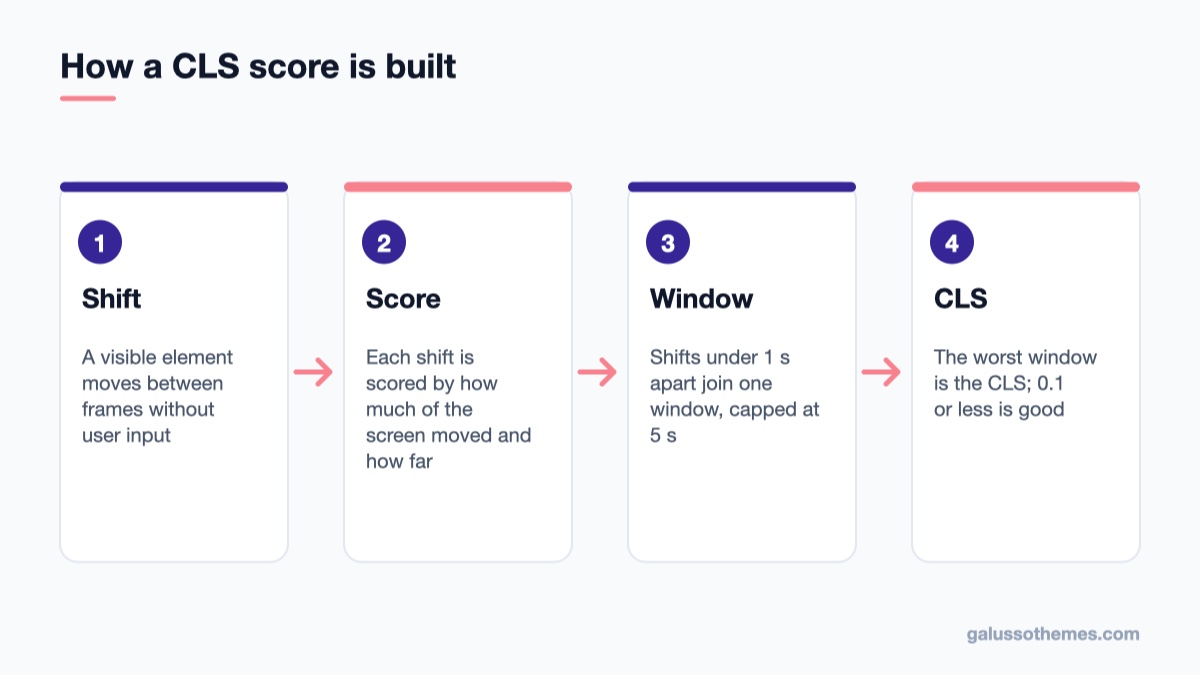
Individual shifts are grouped into session windows, and the worst window becomes the page's CLS.
A layout shift happens when an element that is already visible changes its position between two frames, without the user causing it. The browser gives each shift a score based on how much of the viewport moved and how far it moved. CLS adds those scores up, but not over the whole visit. According to web.dev’s CLS guide, shifts are grouped into session windows: a window collects shifts that happen less than one second apart, and it lasts at most five seconds. Your CLS is the score of the worst window.
The thresholds are simple:
CLS score
Rating
0.1 or less
Good
Above 0.1 up to 0.25
Needs improvement
Above 0.25
Poor
Google evaluates the 75th percentile of real visits, separately for mobile and desktop. So a page passes when at least three out of four visits stay at 0.1 or below.
Two details explain many confusing reports. First, shifts that happen within 500 milliseconds of a tap, click or key press are excluded, because the user expects the page to react. Opening an accordion when someone clicks it is fine. Second, scrolling does not count as input. A header that changes size while the visitor scrolls, or an ad that loads halfway down the page, still counts against you. That is also why lab tools, which usually only record the page load, often report a lower CLS than real visitors experience.
Step 1: Find out which pages and elements shift
Don’t start by changing settings at random. First find out which elements move. Use field data to find the pages, then lab tools to find the elements.
Check real-visitor data
Google Search Console → Experience → Core Web Vitals groups URLs with similar problems and shows “CLS issue: more than 0.1” or “more than 0.25” for mobile and desktop separately.
PageSpeed Insights shows the field CLS for a single URL (when Chrome has enough data for it) above the lab results.
Pick one representative URL from each group, for example one blog post, one product page and the home page. Pages built from the same template usually share the same cause, so fixing the template fixes the whole group.
Find the moving elements in Chrome DevTools
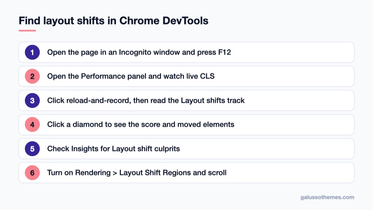
Record the page in the Performance panel and read the Layout shifts track to find what moves.
Open the page in Chrome in an Incognito window (so extensions don’t interfere), then press F12 to open DevTools.
Open the Performance panel. The live metrics view shows the CLS value updating as you load and use the page, which is the easiest way to catch shifts that happen after load, such as when you scroll.
Click the reload-and-record button. When the recording ends, look at the Layout shifts track. Each shift is a diamond, grouped into clusters; larger diamonds mean bigger shifts.
Click a diamond. The Summary tab shows the score, the start time and the elements that moved.
Check the Insights sidebar for Layout shift culprits, which lists likely causes such as unsized images, web fonts or injected content.
For a visual check, press Ctrl+Shift+P (Cmd+Shift+P on a Mac), type “Rendering”, open the Rendering tab and tick Layout Shift Regions. Areas that shift flash blue as you load and scroll the page.
You can also log shifts from the Console while you browse. Paste this and then scroll through the page:
new PerformanceObserver((list) => {
  for (const entry of list.getEntries()) {
    if (!entry.hadRecentInput) {
      console.log(entry.value, entry.sources);
    }
  }
}).observe({ type: 'layout-shift', buffered: true });
Each line shows the score of one shift and the nodes that moved. Hover a node in the console output and Chrome highlights it on the page. Remember that the element that moved is often not the cause: a paragraph moves because the image above it grew. Look one step up the page from the element that is reported.
Once you know which element moves, the fixes below cover the causes you’ll see most often on WordPress sites. Make your CSS changes in a child theme or in Appearance → Customize → Additional CSS, so a theme update doesn’t remove them.
Step 2: Give every image and video its size
An image without dimensions takes up no space until the file arrives, then pushes everything below it down. This is still the most common cause of a poor CLS score.
WordPress already helps with images in post content. Since WordPress 5.5, core adds the missing width and height attributes to images from the Media Library when it outputs post content, so the browser can reserve the right space from the aspect ratio before the file loads. This only works when WordPress can tell which attachment the image is (the wp-image-123 class it adds when you insert an image). Images that often miss out are:
logos and banners hard-coded in theme templates such as header.php;
images added with a custom HTML block, or pasted from another site with an external URL;
slider, gallery and page-builder widgets that build their own markup;
background images on containers that have no height of their own.
Fix them like this:
For template images, add width and height attributes matching the image file’s real pixel size, for example <img src="logo.png" width="240" height="60" alt="Shop name">. Or output them with wp_get_attachment_image(), which prints the attributes for you.
Make sure your CSS lets images scale without losing their ratio: max-width: 100% with height: auto. A theme rule that sets a fixed height together with width: 100% distorts the image and defeats the reserved space.
For sections with a background image, set a min-height or an aspect-ratio on the container so it has a size before the image arrives.
For a slider, give the slider wrapper the height or aspect ratio of its slides. Sliders that measure their slides with JavaScript after load are a classic source of a large shift at the top of the home page.
Lazy loading doesn’t cause shifts on its own, as long as the image has dimensions. WordPress adds loading="lazy" to content images automatically. If you use a lazy-load plugin too, check that it keeps the width and height attributes and uses a placeholder of the same size. Our roundup of WordPress lazy load plugins lists options, but test any of them against your CLS before and after.
Step 3: Reserve space for ads, embeds and iframes
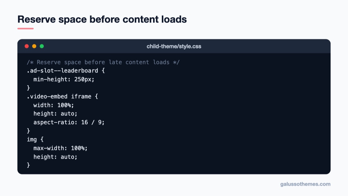
A few CSS rules give ads, embeds and images their space before they arrive.
Ads, YouTube videos, maps, social posts and booking widgets usually arrive as iframes or scripts that inject an iframe later. If the container has no size, the content below it jumps when they appear. The fix, as described in web.dev’s guide to optimizing CLS, is to reserve the space in your CSS before the content arrives:
Replace the class names with the ones your theme or ad plugin uses (inspect the element in DevTools to find them). A few rules that make this work:
Use the most common size. If an ad slot can show several sizes, set min-height to the most likely or the smallest one. A slightly too tall slot is better than a jump.
Don’t collapse empty slots. If no ad is returned, keep the reserved space (show a “house ad” or a neutral placeholder). Collapsing the slot moves the content up, which is another shift.
Move late slots lower. An ad near the top of the viewport shifts the most content. Slots further down affect less of the screen.
Embeds from the block editor. The core Embed block adds a wrapper that keeps a 16:9 ratio for videos when the theme supports responsive embeds. If your videos still jump, the theme may lack that support; the aspect-ratio rule above handles it.
Step 4: Stop late banners and notices from pushing content
Cookie notices, “Free shipping over $50” bars, newsletter boxes and “Sale ends tonight” banners are often inserted by JavaScript after the page has rendered. If they sit at the top of the page in the normal flow, they push the whole page down.
Overlay instead of insert. Show cookie banners and popups with position: fixed at the bottom of the screen, so they cover content instead of moving it. Most consent plugins have a bottom bar or a floating box layout; pick that rather than a top bar that pushes the page.
Render it with the page. If a notice bar must be at the top, output it in the HTML from the server (in the theme template or via a block in the header template part) instead of injecting it with JavaScript after load.
Reserve the space. If content must load later, such as a “related products” row or a reviews widget, give its container a fixed min-height or a skeleton placeholder of the same size.
The same applies to WooCommerce stores: a mini cart, a “recently viewed” strip or a shipping notice that appears above the product grid after an AJAX request shifts every product card below it. Load such elements below the main content, or reserve their height.
Step 5: Load web fonts without text reflow
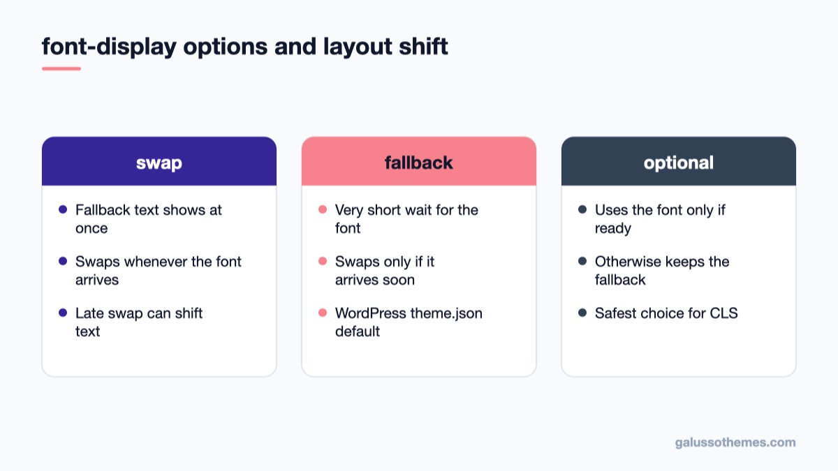
The font-display value decides when a web font may replace the fallback and move your text.
When a web font replaces the fallback font, text can change width and line height. Headings wrap onto an extra line, buttons grow, and everything below moves. You control this with the CSS font-display descriptor:
swap shows the fallback font immediately and swaps in the web font whenever it arrives. Text is always readable, but a late swap can cause a visible shift.
fallback gives the web font a very short window to load; if it misses that window, the fallback is used for a while, and a swap only happens if the font arrives soon after.
optional uses the web font only if it is ready almost immediately; otherwise the page keeps the fallback font for that view. It is the safest option for CLS, and web.dev recommends it when layout stability matters most.
In a block theme, fonts registered in theme.json are printed by WordPress, which uses fallback when you don’t set anything. You can set it per font face with the fontDisplay property:
See the theme.json typography documentation for where this sits in the file. In a classic theme, fonts usually come from an @font-face rule in the stylesheet or from a Google Fonts link; add font-display to the rule, or the &display= parameter to the Google Fonts URL. Our guide to adding Google web fonts to WordPress themes the right way covers loading them cleanly in the first place.
Two further steps reduce font shifts even when the web font does swap in:
Self-host and preload the main font. A font file served from your own domain avoids the extra connection to a third-party server and arrives sooner. Preload only the one or two files used above the fold, such as the body text weight; preloading every weight slows the page down.
Match the fallback to the web font. Choose a fallback with similar proportions, and fine-tune it with size-adjust, ascent-override and descent-override so both fonts take up nearly the same space:
The 107% is only an example. Compare a paragraph in both fonts and adjust the value until the line lengths match. The fewer font families and weights you load, the fewer swaps can happen at all.
Step 6: Fix sticky headers and animations
Two theme features cause shifts after load, which is why they show up in field data but not in a quick Lighthouse run.
Headers that become sticky on scroll
Many themes switch the header from normal flow to position: fixed once you scroll past it. The moment that happens, the header leaves the document flow and the content below jumps up by the header’s height. Because scrolling isn’t counted as user input, this shift counts toward CLS. Two fixes:
Use position: sticky; top: 0; on the header instead of toggling fixed with JavaScript. A sticky element keeps its space in the layout.
If the theme must use fixed, give the page wrapper a padding-top equal to the header height from the start, so nothing moves when the class changes. Also avoid shrinking the header’s height on scroll unless it is already out of the flow.
Animations
Animating properties such as top, left, margin, height or width changes the layout on every frame. Animate transform (translate, scale) and opacity instead; they move the element visually without affecting the layout around it. Entrance animations in page builders that slide elements in from the side are usually built on transform, but custom CSS or older sliders may not be. If DevTools reports shifts on an animated element, that is the place to look.
Finally, keep pages eligible for the browser’s back/forward cache. When a visitor goes back, a cached page is restored instantly with its final layout instead of being loaded and shifted again. Our overview of key strategies for theme performance covers the wider speed picture these fixes fit into.
Common mistakes
Trusting a single Lighthouse run. Lab tests usually only record the page load. Shifts from scrolling, sticky headers and late ads appear only in field data and in the live metrics view. Test by scrolling the whole page.
Fixing the element that moved instead of the cause. The reported element is often just pushed by something above it. Look for the image, ad or banner that appeared just before.
Setting a fixed height on images.height: 400px on responsive images either distorts them or crops them. Use width and height attributes with height: auto, or aspect-ratio.
Preloading every font weight. It delays more important files. Preload one or two, and drop weights you don’t use.
Expecting instant results in Search Console. The report is based on the last 28 days of real visits, so improvements show up gradually. Use the Validate fix button after deploying, then give it time.
A stable theme makes this easier
Many layout shifts come from theme markup: unsized logos, sliders that measure themselves after load, and headers that jump on scroll. A clean theme leaves you less to fix. If you run a magazine or news site with ad slots in the header, between posts and in the sidebar, Viomag gives you a structured layout where you can reserve ad space per slot with the CSS above. For a WooCommerce shop with many product images, GT Organic uses the standard WooCommerce product grid, where product images are printed with width and height attributes, so the cards keep their place as images load.
Wrap-up: your next step
CLS is the easiest Core Web Vital to fix once you know what moves, because nearly every cause has the same remedy: tell the browser how much space something needs before it arrives. Give images and embeds their dimensions, reserve height for ads and late widgets, overlay banners instead of inserting them, load fonts with a sensible font-display and a matched fallback, and keep sticky headers in the layout.
Start today with one template: open your busiest page type in Chrome, turn on Layout Shift Regions, scroll from top to bottom and note every blue flash. Fix the largest one, deploy, and check the live CLS value again. When the page stays at or below 0.1, click Validate fix in Search Console and move on to the next template. If you want a fresh starting point, browse our free WordPress themes.
Hello everyone! We’re Galussothemes content team, we love to write new blogs for WordPress Joomla! and other tech niches everyday. We’re talented young people who hold a strong passion for website development, designing, and marketing. Feel free to leave your comment if you have any issues or questions with our blogs.
Interesting with this topic? You also interest with this articles: